Studio Redesign
Designing and writing the copy for your own site is a notoriously difficult task. The last few times I’ve done this, I’ve done my best to treat it like a client project, but it’s easy for projects like this to lose momentum for a range of reasons.
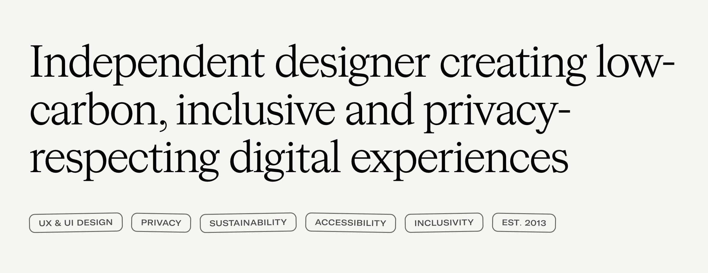
Earlier this week, I refreshed my studio website. It’s not complete, but it’s a much better representation of where I’m at and what I’m up to.
This redesign came together quickly – roughly 4–5 total days for design and development – and I’m writing to give a bit of insight into the objectives and how I was thinking about things.
Background
On first glance, this feels like a departure from the previous site. Some of the more characterful elements have been stripped away, and the colour vibe has shifted. But there are traces of the previous iteration in there: the typefaces and menu areas remaining almost untouched.
One of the key drivers for this update is that I’ve broadened the services I offer. I used to only take on short/medium-term one-off website projects, but I’ve been working with one of my clients for over two years in a role that spans design, UX, accessibility and engineering.
I wanted the studio site to give more space to cover these projects and my role in them, especially as I’ve become increasingly aware of how poorly common design titles align with my skillset. That means writing case studies and talking more about my work process, among other things.
Challenges
The previous site was totally unsuitable for anything other than short bursts of text. This was partly by design: I’d wanted to be able to highlight work without writing case studies, something that had previously blocked keeping my site fresh.
My solution was to create a flexible bento box system that combined project screenshots and testimonials with basic information about a project and my role.
In practice, these boxes had some limitations:
- There was no way to give additional details or context if I needed to (e.g. expand on my role, collaborators, challenges)
- I found it difficult to crop screenshots well for each box type, even when using CSS focal points for images
Another characterful element of the previous site was the use of tilted pills. These were intended to highlight areas of expertise and my role in a project, but they looked much too much like buttons, despite being completely inert:
New site
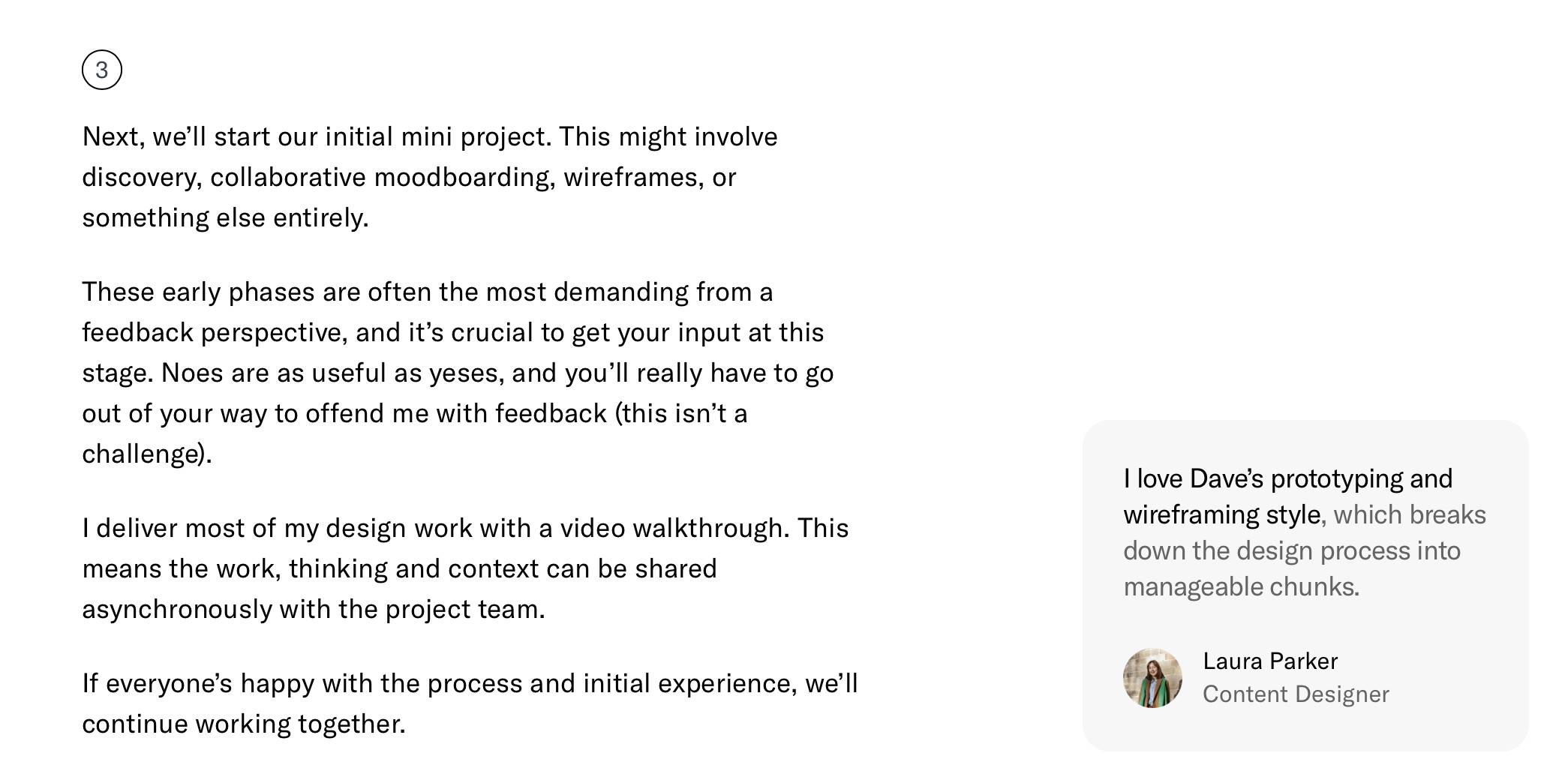
The main goal of the redesign is to better communicate the value of working with me, broadly by accommodating more detail and in-depth content/explanations.
Here are some practical examples of that:
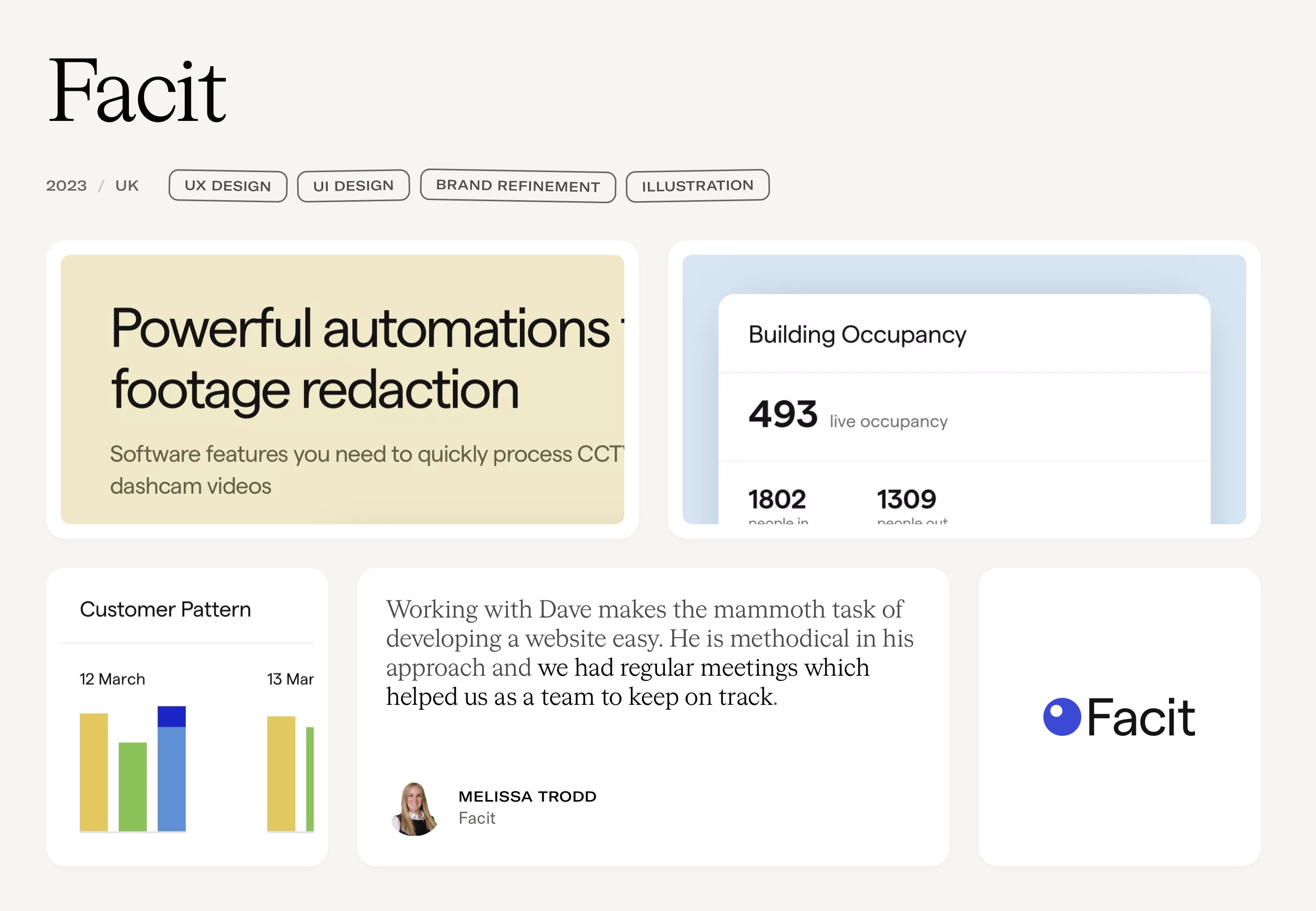
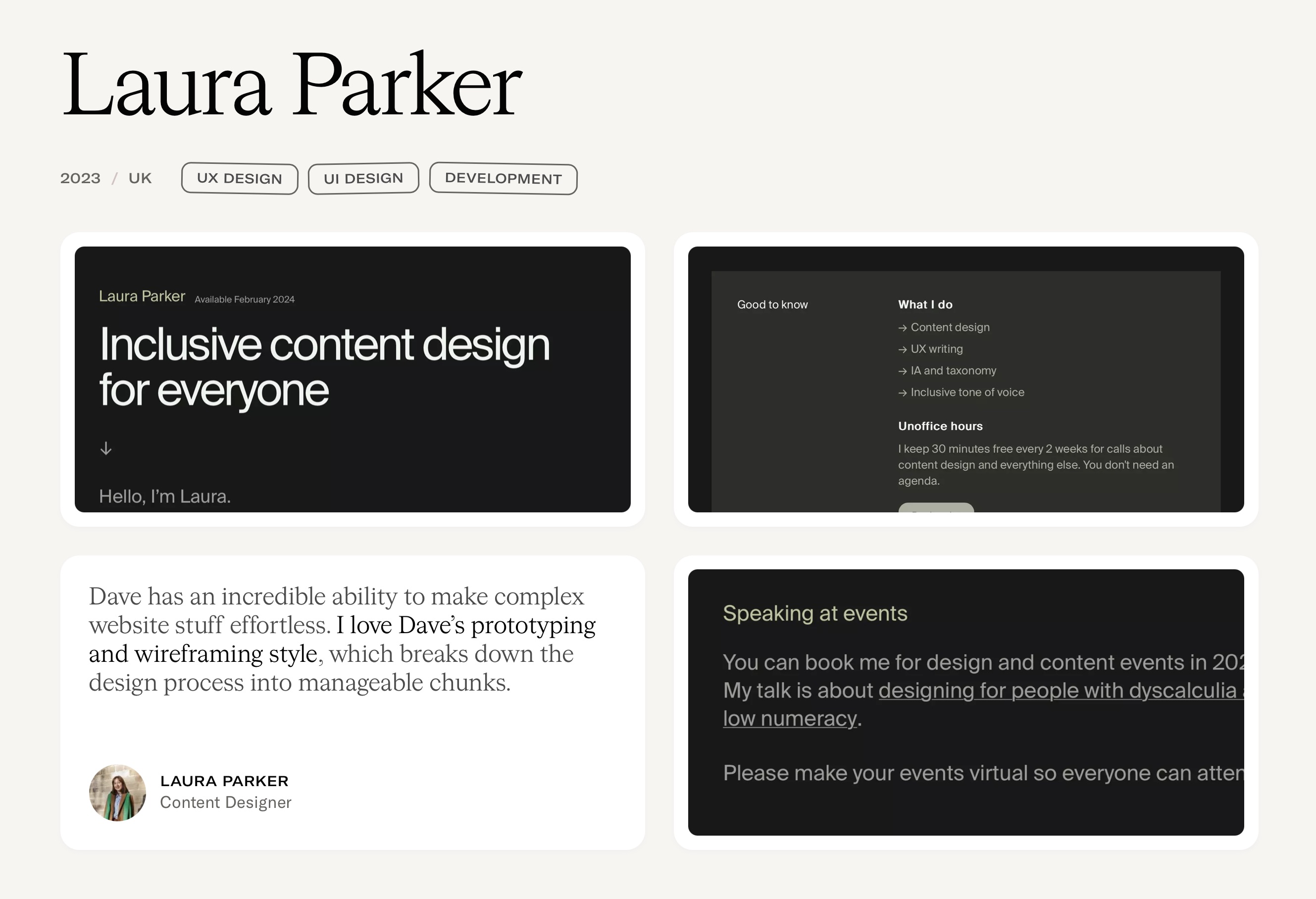
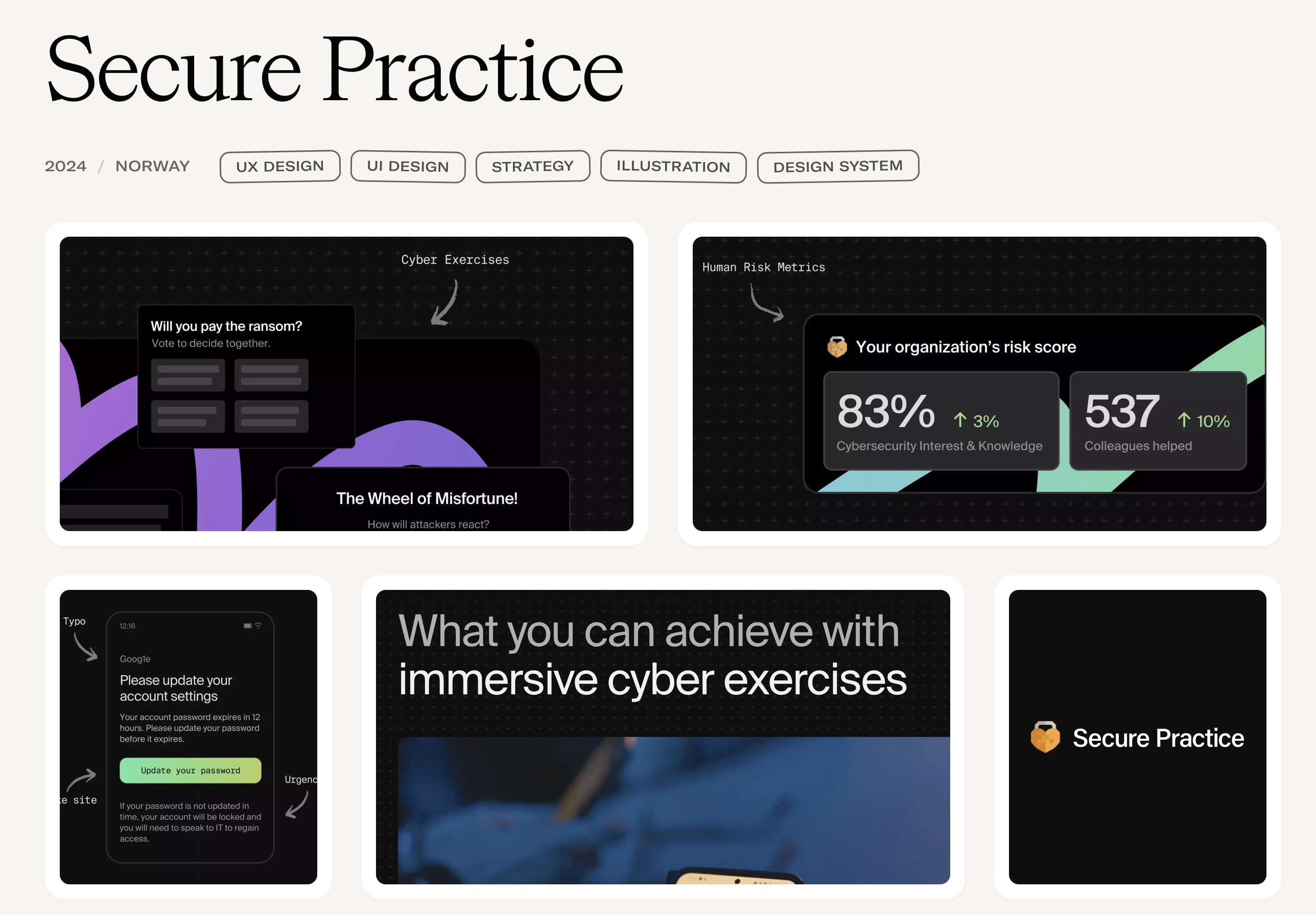
- Giving space to talk about my process in-depth and highlighting my background in development, with testimonials tied to relevant areas
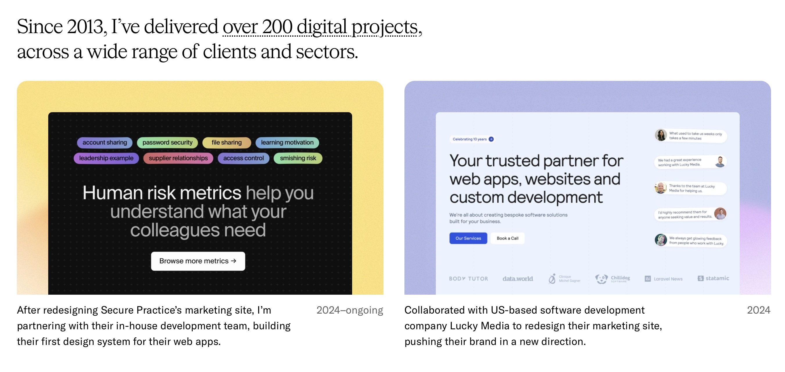
- Enabling recent projects to be uploaded with or without case studies. This gives me the flexibility to post an image and short description initially, with the option to expand to a case study when I have time
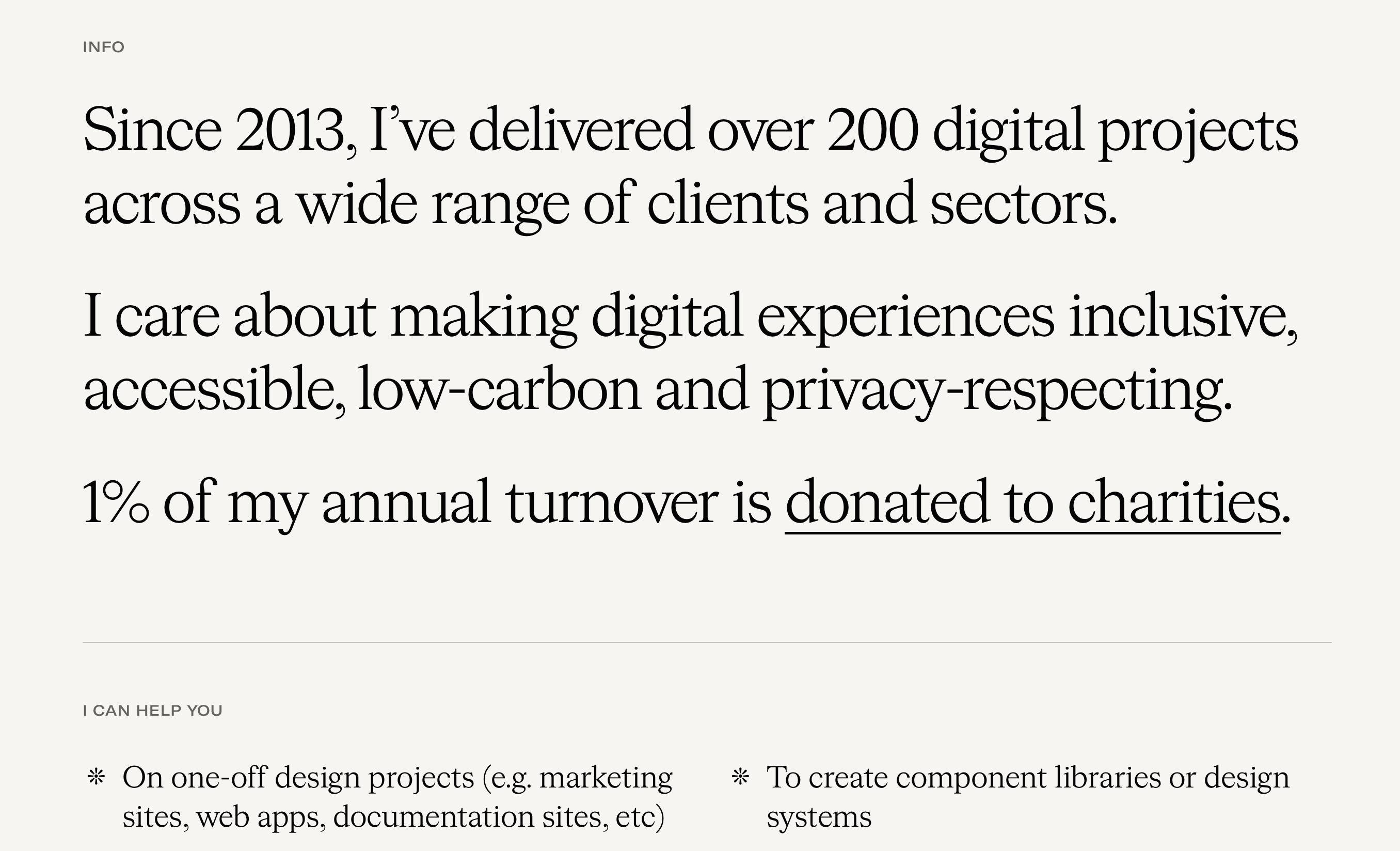
- Leaning into the transparency of how I run the studio: I’ve shared rates and project durations, agreements, my ethics statement and donations for years – these are now grouped together
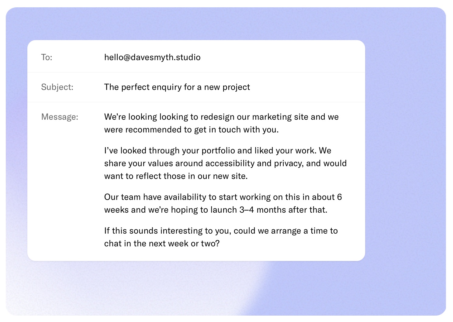
And a h/t to Superfriendly’s old site for the idea to show clients what to put in an enquiry. Here’s my spin on that:
Things to do
This is very much a work-in-progress: I have case studies to write (none are published at the time of writing) and I’ll eventually migrate the site to Kirby.
For now, it’s live in the spirit of “launch when it’s better than what was there before”.
Posted in:
- Process
- Journal